Design can be a pretty precise science – there is a lot of research out on what makes for effective design. A lot is also common sense and practice based on accepted web standards. Here are some concepts you should know.
The fold
The fold is the imaginary line at the bottom of the monitor that divides the immediately visible part of the website (content above the fold) from the part that is visible only after scrolling down (content below the fold).
Your most important message, content or Call to Action should usually be placed above the fold. It is worth mentioning here that the concept of above the fold has come across some scrutiny, because it is not always useful.
Consistency
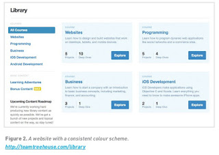
Consistency in use of visual elements is vital to your online presence – across all your properties and channels (such as your email newsletter, Facebook page and mobi site) – as users do not perceive differences between platforms or even on- or offline. They perceive it as one message on multiple touchpoints. Within a website, elements should also be consistent. Colour coding, or colour themes, can be used very successfully to group areas or features on a website. For example, if the help button and help navigation are coloured yellow, then the user will quickly associate yellow with support and assistance. This is another useful shortcut to making the site usable and intuitive.
White space
Spacing on the page allows the eye to travel easily between chunks of information and allows scanning. This can be done by using what is called white space. This space is not necessarily white, but instead is merely empty. It refers to the space between elements on a page.
Always steer clear of cluttered pages. This is especially true for landing pages, where a very specific message is expected. Make your pages as simple and easy to understand as possible.
If you look at the example below, you can see how detailed information can be simplified, which in this case led to a 14% increase in website visitors.

