Which mobile experience should you create?


When creating a platform for mobile users to access your content and brand, you have three options:

1.  Mobile website
2.  Mobile application
3.  Responsive website

Mobile websites make it possible for users to access information about your brand on the move wherever they may be, as long as their phone has a browser and an Internet connection.

Mobile websites need to be designed with the mobile device in mind. Mobile website interfaces demand a simpler approach, and a consideration of screen size and input method.

A native mobile appis software designed to help users perform particular tasks. Examples include a tool for checking the weather, a fuel calculator or a recipe index.

Mobile apps can be sold, or made available for free. There are many developers who create apps in order to derive an income, while free apps that offer users value are often sponsored by brands or advertising. An app can be an excellent tool for connecting with your customer.

The key difference between native applications and mobile websites is that websites can be accessed using any Internet-enabled mobile device, while applications are designed for particular handsets and operating systems and have to be downloaded to the mobile device. That said, mobile apps generally allow for more integration with the device and hence a better user experience, depending on the complexity of the functionality.


Should you wish to target Apple and BlackBerry users, for example, you will need to create two different applications or focus on making a cross-platform application – something that can be difficult and expensive.

It is a good idea to focus on mobile sites when targeting a broader group and building an application when wanting to reach a niche or targeted audience.

A responsive websiteis a website that changes its layout depending on the device it is displayed on – it looks one way on a desktop computer, but then adapts to the smaller screen size and layout on a tablet or mobile phone. In this way, a single development project can cater for multiple device form factors.


Creating a responsive website means you only need to build one website for the full range of devices, from desktop to mobile. This can be a technically challenging exercise and will require a lot of planning upfront to make sure that the site displays correctly on each device.

Here is a table that compares the relative strengths and weaknesses of each option. There’s no right or wrong answer on which one to pick – choose the option that suits your brand, target audience and digital objectives best.

Strengths Weaknesses
Mobi site Accessible from any web-enabled phone

Generally the simplest, cheapest and
quickest option to develop

Easy to use

Can link to content within and outside of the site and reap the SEO benefits
Limited functionality

Uses a separate code base from the full website
Native app Versatile and creative tools can be created

Interactive and fun

Can create real added value through
innovative approaches not possible via a web browser

Ideal for frequently repeated or routine tasks

Promote brand loyalty

Enables access to core phone functions such as GPS, accelerometer, camera, etc.

Could generate income as a ‘paid application’ Performance benefit in some cases
Doesn’t work on feature phones

Different versions needed for different phone makes and models

Entirely different and complex development process

User needs to choose to download them

Users without additional phone storage may not have enough space to install the app

All apps must go through formal app stores, and need to be approved in some instances

Changes need to be released through version updates
Responsive site Technically elegant and device-‘agnostic’ solution

One consistent site accessible across many devices

One data set to work from

Future-proof option that will work on most new devices
Could be complex to develop

Site needs a lowest common denominator approach to cater for all devices

May not work correctly on all sizes and shapes of devices

No agreed standard way yet to develop responsive sites


We will look at mobile sites now and return to responsive sites in more detail later.


Mobile development


Mobile Internet usage has increased dramatically in the last few years and, according to the Washington Post, is predicted to continue increasing by 66% globally each year (Kang, 2013).

Because of this, it’s important for all brands to make themselves accessible on mobile devices. As you learnt in the User Experience Design, mobile devices can fall into a range of categories.

Developing for the mobile phone requires an understanding of the opportunities and challenges presented by mobile technology. Challenges include the obvious, such as a smaller screen and navigation limitations, as well as more complex issues such as file formats.


HTML5


HTML is the language for creating websites and HTML5 is the fifth iteration of the language. It is also the name for a range of technologies that enable modern web browsing features. It’s a specification published by the web standards body (W3C) describing what features are available and how to use them. HTML5 is different from proprietary web software such as Adobe Flash in that the specification is the result of contributions from many organisations, and can be implemented by anyone without having to pay for royalties or licensing fees. You do, however, pay for the development tools provided by the companies.


HTML5 allows browsers to play multimedia content without the use of Flash or a similar plug-in. There is also a technology called Canvas, which allows developers to create rich interactive experiences without the constraints that came with previous versions of HTML. For example, a 3D animated video can now be played – something that used to require the use of Flash or Silverlight.

The goal is a website that just works, without the need for particular browsers or plug-ins to enable certain functionality. To this end, having a standardised way of implementing common features means that the web is open and accessible to all, regardless of competency.

CSS

CSS stands for Cascading Style Sheets and is a style sheet language used to instruct the browser how to render the HTML code. For example, the plain text on a web page is included in the HTML code and CSS defines how it will appear. CSS can set many properties including the size, colour and spacing around the text, as well as the placement of images and other design-related items.

JavaScript

This is the most common client-side language used to create rich, dynamic web properties. Because it is an open-source language, many developers have added functionality that can be more quickly implemented. For example, there are over 1 000 different gallery systems created by JavaScript developers for JavaScript developers.

Flash

Adobe Flash is a language for creating rich, interactive experiences. It supports video, and is often used to create game-like web experiences. Although widely supported by desktop browsers, it has limited (and lessening) support on mobile devices, and is not usable on Apple devices such as the iPhone and iPad. It has a history of being problematic for SEO, although there are ways to work around much of this.


Front-end languages


Web users have come to expect rich, interactive experiences online, and interactive website interfaces are a part of that. Front-end languages, or “client-side” languages, are languages that are interpreted and executed in the user’s browser rather than on the web server.

These experiences range from simple animations through to highly responsive interfaces that require input from the user. There are several technologies available to create such experiences, each with its own opportunities and challenges.

As with server-side languages, you need to consider a few properties of the front-end language you want to use. Bear in mind that server-side languages and front-end languages are often used together, as all web projects require front-end languages for development.

•  Cost: Front-end language development costs are relatively low.
•  Features: HTML, CSS and JavaScript are open source languages often used together and are compatible with most hardware and software. Content developed in these is also more search engine friendly. Flash is known for its video, animation and interactive multimedia capabilities. In many cases, similar results can be achieved with HTML, CSS and JavaScript. Flash can be used alone or in conjunction with other languages. What your end users will be able to view should always be the
most important consideration.
•  Scalability: Depending on the capabilities of the device executing the language, certain features may not be available or certain code may run too slowly to create a good user experience. The front-end code needs to take all the considered devices into account.
•  Browser and OS support: With front-end languages, you have to cater for browser and operating system support. A website will look different on each browser and operating system and this needs to be factored in. If a feature cannot be displayed under certain conditions, work-arounds have to be implemented.
•  Open-source or proprietary software:Any developer can create add-ons for or improve on open-source software, while proprietary software is owned and its use is restricted. It can be cheaper to develop in an open-source front-end language such as HTML, but as HTML is needed to host all web pages, combinations of the two are sometimes used. In most cases and for the languages we cover, however, this is not a major consideration.

There are several options to choose from when it comes to front-end languages, although the most popular by far are HTML, coupled with CSS and JavaScript.


Server-side languages


Server-side languages are the ‘hidden’ web coding languages that determine how your website works and communicates with the web server and your computer. The most popular server-side framework for each language is also discussed.

When choosing a server-side language, you need to consider:

•  Cost:The cost varies depending on the language you choose for your web development project, as the language chosen directly influences the salary of the developer. If information is processed where your website is housed, as opposed to on the client’s computer, it increases the costs. Some languages also require on-going website management and maintenance, which is an additional cost to consider.

•  Scalability:  When planning a project where scalability is a factor, consider whether there are developers readily available to develop in this language. Also find out if there are supporting libraries and frameworks available that suit your project.

Some of the most common and popular server-side languages include PHP, Java, Ruby and the .NET languages. Ask your web developer to advise you on the best language for your specific project.


Static website or CMS


A static website, as the name implies, is one that does not change often – other than the occasional update, the website stays the same over time and no new content is added. Should new content be required, a web developer would need to add it.

CMS stands for content management system. A CMS is used to manage the content of a website. If a site is updated frequently and if people other than web developers need to update the content of a website, a CMS is used. Today, many sites are built on a CMS, which can also allow content of a website to be updated from any location in the world by signing into an online management interface for the CMS.

There are three types of CMS you can choose from:

•  Bespoke: This is a CMS that is built specifically for a certain website, and many web-development companies build their own CMS that they use for their clients. This option is highly tailored and customised to your website, and can be more expensive than other options. It is also possibly less flexible.

•  Off the shelf:A CMS can also be pre-built by an external company or developer. These can be bought like any other software on the market. While this may have fewer custom features, it’s potentially a more cost-effective option than a bespoke CMS.

•  Open source: There are many open source, pre-built CMS options available, some of which are free. Open source means that anyone can see the code that the CMS is built with, and can manipulate or improve it (and share this with everyone else using the CMS). An open-source CMS can be more rudimentary than paid options, but is also easy to tailor to your needs, and there is often a community that can create the solutions you need.

Some widely used open-source CMS solutions include:

•  WordPress (www.wordpress.com)
•  Joomla (www.joomla.org)
•  Drupal (www.drupal.com)

A CMS should be selected with the goals and functions of the website in mind. A CMS needs to be able to scale along with the website and business that it supports, and not the other way round!
Of course, the CMS selected should result in a website that is search engine friendly.

Here are some key features to look out for when selecting or building a CMS:

•  Meta and title tag customisation:the CMS should allow you to enter your own meta tags for each page, as well as allow full customisation of title tags for each page.
•  URLs:instead of using dynamic parameters, the CMS should allow for clean URLs by using server-side rewriting. Clean URLs consist only of the path to a webpage without extra code (a clean URL could look like

this: http://example.com/cats, while an unclean URL could look like
this: http://example.com/index.php?page=cats). It should allow for the creation of URLs that are:

o  static
o  rewritable
o  keyword rich

Be careful when building clean, descriptive and dynamic URLs from CMS content. Should you use a news heading (‘Storm’, in this example) as part of your URL (http://www.site.com/cape/storm) and someone changes the heading to ‘Tornado’ (http://www.site.com/cape/tornado), this will alter the URL and the search engines will index this as a new page, but with the same content as the URL which had the old heading. Bear this in mind before adding dynamic parameters to your URLs.

•  Customisable navigation: a good CMS will allow flexibility when it comes to creating the information architecture for a website. For the purposes of adding additional content for search engines, a CMS should not require that all content pages be linked to from the home page navigation. This allows content to be added for search engine optimisation (SEO) purposes, without adding it to the main navigation.

•  The CMS needs to have good supportfor managing SEO considerations such as URL rewriting and avoiding duplicate content issues.

•  Customisable image naming and alt tags for images:a good CMS will allow you to create custom alt tags and title attributes.
•  Robots.txt management: ensure that you are able to customise the robots.txt to your needs, or that this can at least be managed using the meta tags.

Finally, using a CMS that supports standards-compliant HTML and CSS is very important, as without it, inconsistencies may be rendered across various browsers. It also ensures faster loading time and reduced bandwidth, makes mark-up easier to maintain, supports SEO efforts and ensures that every visitor to a website, no matter what browser they are using, will be able to see everything on the website.


Web development


Web development is the process of taking finished web designs and transforming them into fully functioning, interactive websites. Development is what gives life and movement to the static designs, and enables users to access the website through their web browsers. This is done by translating the designs into web-coding languages that can be interpreted and displayed by web browsers.

Learning to code your own website is not in the scope of this textbook and requires years of practice and some considerable technical know-how. But we can teach you to understand the aspects that go into creating a website, the process that should be followed, and how to help in making key choices about your website.When developing a website, you need to make three key decisions (don’t worry,
we’ll explain each one below):

•  Should your website be static or should it have a content management system (CMS)?
•  Which server-side language should be used?
•  Which front-end language should you use?


Collecting and collating design assets


Elements such as your logo and brand colours represent your brand. The latest versions of these brand assets need to be available to the designer or marketing agency designing your website.

Getting the right brand assets to designers in a good-quality format that they can easily access saves time and avoids expensive mistakes. By doing this, your campaign won’t be designed with the wrong version of your logo or with incorrect brand colours.

Here is a list of brand assets that a designer requires to start working on your project. The quality, format (or file type) and file size are all important considerations.

You need to provide:

Brand guidelines or style guidein Adobe Reader (PDF) format.
Logo and other key brand elements.These could be in Illustrator format (ai) or Photoshop format (psd). Best practice is to have your logo designed using vector graphics. If your logo or other brand assets are created in this format, they can be enlarged without losing quality. Other formats
do not allow scaling and if displayed larger than the original designer intended will result in a poor-quality image. If you do not have a vector version of your logo available, then you should make sure that your image is at least 1 000 pixels wide.

Image libraries. Photographs and images can be hosted online, where the designer can access them with a login. They can also be sent to the designer on a CD. Make sure the images are of sufficient quality. It is best practice to provide images that are 300dpi. This is the measure of
a high-quality image that will retain its quality if resized. Although all images on the web are displayed at 72dpi, a higher quality image will give your designer room to optimise and resize and crop or cut images where needed.

Fonts folder. You will need to provide both Apple Mac and PC versions of the fonts that are listed in your Style Guide. Many designers work on Macs, which use different font versions from those read by PCs.

Brand colors need to be given to digital designers in RGB format. RGB stands for red, green and blue and is the standard for colors online.

•  Any existing creative assets that have been created for your brand over time such as:

o  Print designs
o  TV ads

•  Website copy should be made available before the final design is required. This prevents delays caused by designers waiting for material.

•  Any additional assets your designer may need that can be downloaded or sent, such as your price guides or product descriptions.

Fonts

Copy conveys your brand message to your client or customer and should be easy to read and search engine friendly. The CI is expressed through fonts, also known as typefaces.

Typographic layout can draw attention to the content users should see first. Indicate which pieces of information take precedence. Importance can be signified by text size, colour, weight, capitalisation and italics. Placement also contributes to how important text appears.

Some fonts are common to all computer users. These fonts are known as web-safe fonts. Anyone accessing websites that use these fonts will be able to view them as the designer intended and search engines will be able to search these websites easily. Fonts that are not web safe may appear very differently on some computers. Designers don’t always like to be limited to using only web-safe fonts, and brand guidelines in most instances don’t take web-safe fonts into account. This means that fonts must be embedded by a developer using tools such as Typekit, or alternative fonts need to be selected.


Typographic layout can draw attention to the content users should see first. Indicate which pieces of information take precedence. Importance can be signified by text size, colour, weight, capitalisation and italics. Placement also contributes to how important text appears.


Colour theory


Colour has an incredible psychological effect on people. Based on our culture, preferences and learned cues, people interpret colours in very specific ways – and this can be used to inform and steer the user’s experience. Colour theory online refers to the principles of combining colours to attract people toward your brand and its offerings (Focus Designer, 2012).

Most of the colour choices will be dictated by the CI, but tones and shades will be selected by the designer.

Contrast is very important when displaying text online. If the text and background are the same colour and there is no contrast, this means that the text will not be readable. Best practice is to use a light background colour and a dark colour for the text. Black text on a white or light grey background works well. Contrast is also a good way to draw your reader to and differentiate between different aspects of the page.

Colours also hold different meanings and associations for people. Ensure that you know these meanings for the audience that you are targeting – for example, red signifies luck in Asian cultures, but danger in many western cultures.

There are some colour-related web design conventions you should follow:

•  Red is used for warnings, error messages and problems.
•  Green is used for successful actions, next steps and correct submissions.
•  Blue is best used for hyperlinks.

Your Call to Action is one of the most important parts of your website and can be displayed as a link or button. As this is meant to attract the eye, choose a colour that stands out. When Dmix tested this out, as you can see in this example, they experienced an increase of 72% in conversions by using the more striking red button instead of the green one (Chopra, 2010).


Design theory


Design can be a pretty precise science – there is a lot of research out on what makes for effective design. A lot is also common sense and practice based on accepted web standards. Here are some concepts you should know.

The fold

The fold is the imaginary line at the bottom of the monitor that divides the immediately visible part of the website (content above the fold) from the part that is visible only after scrolling down (content below the fold).

Your most important message, content or Call to Action should usually be placed above the fold. It is worth mentioning here that the concept of above the fold has come across some scrutiny, because it is not always useful.

Consistency

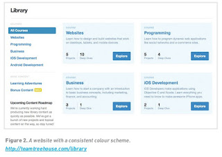
Consistency in use of visual elements is vital to your online presence – across all your properties and channels (such as your email newsletter, Facebook page and mobi site) – as users do not perceive differences between platforms or even on- or offline. They perceive it as one message on multiple touchpoints. Within a website, elements should also be consistent. Colour coding, or colour themes, can be used very successfully to group areas or features on a website. For example, if the help button and help navigation are coloured yellow, then the user will quickly associate yellow with support and assistance. This is another useful shortcut to making the site usable and intuitive.


White space

Spacing on the page allows the eye to travel easily between chunks of information and allows scanning. This can be done by using what is called white space. This space is not necessarily white, but instead is merely empty. It refers to the space between elements on a page. 

Always steer clear of cluttered pages. This is especially true for landing pages, where a very specific message is expected. Make your pages as simple and easy to understand as possible.

If you look at the example below, you can see how detailed information can be simplified, which in this case led to a 14% increase in website visitors. 


Visual identity and designing for persuasion


The visual interface – the design of a website – is what the user sees and interacts with. It’s the visual representation of all the hard work that goes into developing a website. It’s what the site will first be judged by, and is the initial step in creating a delightful user experience. In case you haven’t realised it, it matters a lot.

There is a close relationship between UX and visual design – sometimes these are even done by the same person. At other times, the visual designer will use the documents created by the UX designer and add the visual skin. In this case, it’s like comparing the architect (UX designer) to the interior decorator (visual designer).

Design is not just about aesthetics, although looks are very important. Design is about the visual clues we give users so that they know what to do next. Design is the way in which we communicate with our users. It assures web visitors of our credibility and ability to answer their questions, and turns them into customers.

Good interface design involves many things (including years of training and experience), but here are a few basic considerations. These are closely linked to UX and the visual designer plays a key role in defining them:

•  Navigation:the signage of the site, indicating to users where they are and where they can go.
•  Layout: how content is structured and displayed.
•  Headers:the usually consistent top part of a web page.
•  Footers:as you may have guessed, the usually consistent bottom part of the page.
•  Credibility:telling users that you are who you say you are.

Visual identity

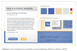
The visual identity answers the question: “How do users know it’s us?” Certain design elements should be carried through on all web assets created for a brand, as well as print and traditional communication media. Often, the visual identity guidelines for the web are codified into a Digital Style Guide document to ensure consistency across different agencies, designers and teams. This
document can include guidelines for creating all manner of web assets, including banners, social media content, and website design elements.

The logo is the most prominent way to reinforce your brand identity on the website. The logo is part of a brand’s corporate identity (CI). Be aware that logos designed for printing on letterheads will need to be adapted for the web and legibility, particularly when it comes to resizing.

The primary font is typically used for prominent headings on the site, while body copy is often set in a standard web font that closely matches the primary font.

Font replacement is widespread and involves embedding non-web safe fonts into the code, using Typekit, for example. With Typekit, subscribers can embed simple code that allows them to choose from hundreds of fonts for their website (Wikipedia, 2013). However, the growing popularity of HTML5 in modern browsers makes font replacement less necessary.

Menu and button style, as well as icons, are also part of a site’s visual identity. Even when a user is viewing a small part of a site or page, it should look as if it belongs to the site as whole.


Web design


Web design is the process of creating all the visual aspects of the interface. This covers the layout, colour scheme, images, logos, type, design elements (such as buttons and links), and anything else that you can see.


The web is a visual medium, so design is a very important part of creating successful assets that are both engaging and effective. At the same time, however, designers need to keep in mind the technical aspects of design, as well as the all- important human factor. Digital properties shouldn’t just be beautiful; they also need to create a good experience for the visitor and meet business objectives.