| Term | Definition |
|---|---|
| Above the fold | The content that appears on a screen without a user having to scroll. |
| Accessibility | The degree to which a website is available to users with physical challenges or technical limitations. |
| Alt text | The ‘alt’ attribute for the IMG HTML tag. It is used in HTML to attribute a text field to an image on a web page, normally with a descriptive function, telling a search engine or user what an image is about and displaying the text in instances where the image is unable to load. Also called Alt Tag. |
| Branding (or visual identity or corporate identity) | How your logo, colours and styling elements are translated from traditional print-based assets to digital. |
| Breadcrumbs | Links, usually on the top of the page, that indicate where a page is in the hierarchy of the website. |
| Call to Action | A phrase written to motivate the reader to take action (sign up for our newsletter, book car hire today etc.). |
| Content Management System (CMS) | A system that allows an administrator to update the content of a website, so that a developer is not required to do so. |
| Common page elements | Items that appear on every page of a website. |
| Cascading Style Sheets (CSS) | A programming language that defines the styles (fonts, colours, etc.) used to display text and content. Web pages are one of the places that this language is used. |
| dpi | Dots per inch (in an image). On the web, the screen resolution is 72dpi. |
| Flash | Technology used to show video and animation on a website. It can be bandwidth heavy and unfriendly to search engine spiders. |
| HyperText Markup Language (HTML) | The code language predominantly used to create and display web pages and information online. |
| HTML5 | A broad range of technologies that allow for rich media content and interaction on the scale of Adobe Flash, but which, unlike its counterpart, does not require additional third-party plugins. It allows rich multimedia content to be displayed that can easily be viewed by users, computers and devices. HTML5 is the next iteration of the HTML standard. |
| Information architecture | The way in which data and content are organised, structured and labelled to support usability. |
| Landing page | The page a user reaches when clicking on a paid or organic search engine listing. The pages that have the most success are those that match up as closely as possible with the user’s search query. |
| Meta data | Information that can be entered about a web page and the elements on it to provide context and relevant information to search engines. |
| Native mobile application | A mobile application designed to run as a program on a specific device or mobile operating system. |
| Navigation | How a web user moves through a website, and the elements that assist the user in doing so. |
| Open source | Unlike proprietary software, open source software makes the source code available so that other developers can build applications for the software, or even improve on the software. |
| Proprietary software | Any software that one or more intellectual property holders own and licence to others in exchange for compensation, subject to certain restrictions. Licensees may not be able to change, share, sell or reverse engineer the software. |
| Robots.txt | A file written and stored in the root directory of a website that restricts search engine spiders from indexing certain pages of the website. |
| Search engine results page (SERP) | The actual results returned to the user based on their search query. |
| Sitemap | On a website, a page that links to every other page in the website, and displays these links organised according to the information hierarchy. |
| Universal Resource Locator (URL) | A web address that is unique to every page on the Internet. |
| Usability | A measure of how easy a system is to use. Sites with excellent usability fare far better than those that are difficult to use. |
| Web application framework | Software used to help create dynamic web properties more quickly. This is done through access to libraries of code for a specific language or languages and other automated or simplified processes that do not then need to be coded from scratch. |
| W3C | World Wide Web Consortium, which oversees the Web Standards project. |
| Web server | A computer or program that delivers web content to be viewed on the Internet. |
| eXtensible Markup Language (XML) | A standard used for creating structured documents. |
Web Development and Design Key terms and concepts
Introduction Web Development and Design
Websites are, in many ways, at the heart of successful digital marketing. They are your home on the web, a shop window over which you have full control, and often the first place people stop to find out more about you.
Web development and design applies to more than just websites – the principles can be used for any digital assets you create, from mobile platforms to social media profiles.
Creating online assets involves three key processes – planning and design, which create the appearance, layout and style that users see, and development, which brings this imagery to life as a functioning web tool.
The fundamental principle of good development and design is to understand your users: the people who will actually be using and interacting with your website. What are they looking for? What are their objectives? Your offering must have user experience central to the process.
• How the web development process works, from planning through to design and launch.
• Development and design best practices and the principles of designing for persuasion.
• How to assess the quality and effectiveness of web development and design implemented by suppliers or agencies.
• How to evaluate the need for either a static or CMS website.
Tools of the trade
UX tools range from rudimentary (pen and paper) to highly sophisticated (web applications and tech tools). Here is a brief roundup of popular options.
Balsamiq (www.balsamiq.com) bills itself as a ‘rapid wire-framing tool’ and is great for creating fun, low-fidelity wireframes and simple prototypes. It works both as a web app and a desktop download, and has built-in features for collaborating with other team members.
Axure(www.axure.com) is an all-purpose prototyping tool that allows you to create fully interactive wire-framed websites without needing to code anything. A useful feature is that it also generates technical specifications for developers to work from, based on the interactions and links you create in the prototyping process.
Gliffy (www.gliffy.com) is a web-based tool that allows you to create a wide range of diagrams – everything from wireframes to sitemaps to charts. It offers a free version, with a paid Pro Account that offers more advanced features. While its strength lies in wire-framing, it also creates sitemaps, which means you could have several features in one place.
Morae(www.techsmith.com/morae.html) is a good place to start if you’re looking for a web-based replacement for user labs. This innovative paid-for tool allows you to research users interacting directly with your, or a competitor’s, website. The tool records video and audio of the user, and also captures their behaviour on the screen, so you can remotely watch exactly what they are doing and how they are reacting in person. The tool also allows you to prompt and interact with the user in real-time chat, track where they look on the screen, and more.
User-testing methodologies
There are many ways to conduct UX user testing. Here are a few options to get you started.
Hallway testing
Hallway testing is the name given to quick, informal tests conducted in the office – they often literally involve stopping someone in the hallway and asking them to take part in a quick test.
This is a great way to perform broad, rough testing to help spot any glaring errors that the UX team haven’t seen.
Observation and user labs
Generally, the purpose of an observational study in a user lab is to get a holistic overview of how the user responds to the website, and to spot any major issues. Looking at the user’s body language and facial expressions can help to reveal how they feel about the experience itself, while looking at how they work through the tasks assigned to them shows the usability and intuitiveness of the website.
User labs tend to involve one participant at a time being tested and observed by one or more researchers. Specialised testing labs have features such as one-way mirrors and video feeds to facilitate this, but you could easily set up a webcam streaming to a computer outside the room to simulate the same effect.
Split testing and multivariate testing
A split test, also called an A/B test, involves creating two distinct versions of the same web page, usually with one specific element changed (for example, a different image or CTA). The versions are served to separate groups of users, and the tester then analyses which page is more effective.
A multivariate test functions in the same way, except that several different elements on the page are changed at the same time, showing which combination of elements works best.
Eye tracking
Eye tracking is the process of recording what exactly users are looking at, and how their gaze travels across a web page.
Eye tracking tests are useful for discovering if the user understands and can follow the basic flow of the web page, as well as to determine if certain elements are where users expect them to be. These can be conducted with webcams or specialised software that tracks a user’s gaze or a mouse cursor.
Surveys
Surveys are questionnaires, usually distributed remotely via the website, that ask users for their impressions of the site in question. Surveys are excellent for canvassing opinions of your website after it has gone live.
Surveys can help to answer the ‘why’ questions that arise from quantitative data (such as web analytics). For example, you may find that users are abandoning a specific page on your website even though it has interesting content. The survey may reveal that they find the layout confusing or simply aren’t as interested as you thought they’d be.
Conduct testing
User testing means giving one or more users access to a website or prototype and observing how they behave when using it. The purpose of this is to discover problems and gain insights that can be used to improve the final product.
The goal of user testing is not to eliminate each and every potential problem on a website – that’s simply not possible (especially if you consider how subjective this can be). The goal is to work towards creating the best possible experience for the user by constantly improving and optimising.
The two biggest questions around testing tend to be ‘What do I test?’ and ‘When do I test it?’ The answers are simple – test as much as possible, as often as possible, and as early as possible.
 User testing follows a set process.
1. Formulate a question to test
Spend a little time nailing down exactly why you want to perform a test and what you hope to learn from it. Formulating a simple, clear set of questions to test will allow you to focus on what’s important, and will make choosing participants and techniques easier.
2. Choose a test and prepare
Once you know what the purpose of your test is, you can decide on a specific methodology to use. To choose the right one, answer these questions:
• How much time and money do I have for this test?
• What facilities are available?
• How many participants do I want to test?
• At what stage is the project?
3. Find subjects
Possibly the biggest challenge in the testing process is that of finding the right test subjects. So, how do you do this?
First of all, draw up a list of criteria that you want your subjects to fulfil – must they be men or women, of a certain age, in a certain industry, with or without children?
The considerations can be endless, so limit yourself to the top three or not more than five most important ones.
Now, spread the word about the test through the most appropriate channels to this group. This can involve everything from advertising in a glossy magazine to posting on a Facebook page to chatting to some friends or neighbours. You can also pay a market research recruitment agency to find suitable candidates. The method you choose will depend largely on your budget and timeline, as well as on how many participants you want to recruit.
Once you get enough responses, you will have the chance to screen applicants. Screening is the process of filtering people into those who are suitable for the test and those who are not, because they do not meet certain criteria.
4. Test
At this point, you are ready to begin testing! Tell the user what you want them to do, and let the test run. Don’t interfere!
5. Analyse
Analysing means taking all of this existing data and transforming it into accurate, objective and useful insights.
For example, your user observation study found that users tended to click on ‘contact us’ when looking for the opening times of a restaurant. It’s up to the researcher to analyse this – were the users confused by something? Was there no other obvious place to click? Were they expecting to find this information easily, but found themselves struggling and making a best guess? Discovering the reason
can then lead to possible solutions – possibly the opening hours should be placed on the home page or in the header; or perhaps they should simply be added to the ‘contact us’ page. It’s these practical outcomes that are the cornerstones of UX testing.
6. Report
Reporting is the process of sharing your UX test results with the people who need them. Reports provide insights, information and recommendations by summarising the results of the testing phase, and the UX practitioner’s analysis of what happened. Ideally, the whole team should be involved in analysing the test data to encourage them to buy in to the UX process.
Reporting can take various forms, from verbal discussions to professionally designed presentations. The most important consideration here is your audience and their needs.
7. Implement
Implementing means putting your user testing outcomes into practice. This will, of course, mean very different things at different stages of the project. If you’re testing your overall approach in the beginning planning phase, the implementation could involve taking a new direction on the project. Testing a working high-fidelity prototype may reveal that some design elements need to change.
8. Start again
We’ve said it before and we’ll say it again – testing is not a once-off action, it’s a constant process. Once you’ve run your test and implemented your solutions, your project can continue – but very soon you’ll need to test again. Aim to run a test every time you reach a major new stage of the project, or add something that is brand new or has raised controversy in the team. Even after the project has gone live, there is space and reason to keep testing, iterating and optimising.
The goal of user testing is not to eliminate each and every potential problem on a website – that’s simply not possible (especially if you consider how subjective this can be). The goal is to work towards creating the best possible experience for the user by constantly improving and optimising.
The two biggest questions around testing tend to be ‘What do I test?’ and ‘When do I test it?’ The answers are simple – test as much as possible, as often as possible, and as early as possible.

1. Formulate a question to test
Spend a little time nailing down exactly why you want to perform a test and what you hope to learn from it. Formulating a simple, clear set of questions to test will allow you to focus on what’s important, and will make choosing participants and techniques easier.
2. Choose a test and prepare
Once you know what the purpose of your test is, you can decide on a specific methodology to use. To choose the right one, answer these questions:
• How much time and money do I have for this test?
• What facilities are available?
• How many participants do I want to test?
• At what stage is the project?
3. Find subjects
Possibly the biggest challenge in the testing process is that of finding the right test subjects. So, how do you do this?
First of all, draw up a list of criteria that you want your subjects to fulfil – must they be men or women, of a certain age, in a certain industry, with or without children?
The considerations can be endless, so limit yourself to the top three or not more than five most important ones.
Now, spread the word about the test through the most appropriate channels to this group. This can involve everything from advertising in a glossy magazine to posting on a Facebook page to chatting to some friends or neighbours. You can also pay a market research recruitment agency to find suitable candidates. The method you choose will depend largely on your budget and timeline, as well as on how many participants you want to recruit.
Once you get enough responses, you will have the chance to screen applicants. Screening is the process of filtering people into those who are suitable for the test and those who are not, because they do not meet certain criteria.
4. Test
At this point, you are ready to begin testing! Tell the user what you want them to do, and let the test run. Don’t interfere!
5. Analyse
Analysing means taking all of this existing data and transforming it into accurate, objective and useful insights.
For example, your user observation study found that users tended to click on ‘contact us’ when looking for the opening times of a restaurant. It’s up to the researcher to analyse this – were the users confused by something? Was there no other obvious place to click? Were they expecting to find this information easily, but found themselves struggling and making a best guess? Discovering the reason
can then lead to possible solutions – possibly the opening hours should be placed on the home page or in the header; or perhaps they should simply be added to the ‘contact us’ page. It’s these practical outcomes that are the cornerstones of UX testing.
6. Report
Reporting is the process of sharing your UX test results with the people who need them. Reports provide insights, information and recommendations by summarising the results of the testing phase, and the UX practitioner’s analysis of what happened. Ideally, the whole team should be involved in analysing the test data to encourage them to buy in to the UX process.
Reporting can take various forms, from verbal discussions to professionally designed presentations. The most important consideration here is your audience and their needs.
7. Implement
Implementing means putting your user testing outcomes into practice. This will, of course, mean very different things at different stages of the project. If you’re testing your overall approach in the beginning planning phase, the implementation could involve taking a new direction on the project. Testing a working high-fidelity prototype may reveal that some design elements need to change.
8. Start again
We’ve said it before and we’ll say it again – testing is not a once-off action, it’s a constant process. Once you’ve run your test and implemented your solutions, your project can continue – but very soon you’ll need to test again. Aim to run a test every time you reach a major new stage of the project, or add something that is brand new or has raised controversy in the team. Even after the project has gone live, there is space and reason to keep testing, iterating and optimising.
Define the visual design
Before a user interacts with your carefully considered content, your excellent navigation structure and slick search bar, their first impression comes from the look of the website – the colours, graphics, and overall design elements that are used. As people are spending more and more time on the web, they are less tolerant of websites that don’t look good (and credible).
While a website is not an art installation, it is a design project, and the fundamentals of good design apply. While much of the visual design expertise will come from the graphic designer, it’s valuable for the UX practitioner to know the following principles of visual design.
Colour
Colour has an incredible psychological effect on people. Based on our culture, preferences and learned cues, people interpret colours in very specific ways – and this can be used to inform and steer the user’s experience. When choosing the colour palette for the website, be aware of legibility and
accessibility concerns. Using a lot of open or white space often makes sites appear
simple and easy to read.

Imagery
The choice of images used on the website can have a massive effect on how users behave and interact on the page. You can never be quite certain which images will have the best results, so this is one area where you will need to do a lot of testing (more on that below).
Humans tend to gravitate towards and identify with pictures of other humans. We have an innate instinct to look at faces to understand a person’s feelings and mood – and we even look in the same direction as these characters, according to usability specialist James Breeze (Breeze, 2009).
Assemble the other elements
Once you’ve defined your content and mapped out the basic layout of each page, you need to add in all the extra elements that your website will need – remember that the page should only ever contain the elements a user might need to support them in their task. These can include:
• Calls to action. CTAs can take a variety of shapes and forms, from in-text links to large buttons.
• Forms. These are interactive fields where users can enter their contact details or other information, for example, to sign up for a newsletter or enter a competition.
• Search. Many sites can benefit from having a search function, both to help users navigate and to make finding specific information easier.
Calls to Action
Successful CTAs are simple, quick, clear actions that don’t require the user to do anything scary or make a commitment. They should always do exactly what they state to instil confidence and clarity. It’s all about managing the user’s expectations – do they actually go where they think they will, or perform the action they expect?
Positioning
The primary CTA should usually appear above the fold to capture the attention focused here. Other CTAs can appear below the fold, and the main CTA can also be repeated lower down.
Prioritisation
A single web page can be built around one CTA, or could incorporate a wide range of possible desirable actions. This all comes down to what the page and website overall is seeking to achieve, based on the business requirements.
When multiple CTAs are used, there should be one primary one that stands out strongly and the others should be more muted, playing a supporting role. CTAs can be differentiated through colour, shape, placement and size. The less choice, the better.

Clickability
Any CTAs that can be clicked must look ‘tactile’, or touchable. This means they must stand out somehow from the background and from static elements. One approach is to make the button look like a realbutton, standing out from its environment. Another train of thought advocates for the ‘flat design’ approach as a more elegant and modern expression of this.

Quantity
Finally, be sure not to overwhelm users with too many choices. Stick to one central CTA per page, making it obvious to users what the main goal, action or outcome of the page is.
Forms
Forms are extremely useful tools for gathering user information and encouraging interaction on the site. Users are generally familiar with them and have some experience filling them out, and there are lots of web conventions that govern how these should be set up. As a general rule, the shorter you can make your form, the better. The fewer fields a user has to fill out, the more likely they are to complete the process.
Steps and sections
Simple forms with only a few fields can be assembled as a series of boxes. For forms that are longer, for example, those in eCommerce checkouts or complex registration processes, it makes sense to split them up into manageable portions – and manage a user’s expectations by clearly indicating what the next step is.

Relevance
Simplicity is a key consideration – forms should be as short and clear as possible. The effort must be equal to the reward gained. All of the fields included must be clearly relevant to the purpose of the form, otherwise the user may get confused or suspect that you are harvesting their information.
Assistance
It is a good idea to include help for users filling out forms. This is especially the case where a specific field requires inputs to be entered in a certain way – and doubly so for password fields with special rules. Users will not instinctively know the rules associated with specific fields, so you must give plenty of guidance along the way.

Validation means giving the user feedback on the inputs they have submitted – whether correct or incorrect. Validation can happen at two points – after the user has submitted the form, or during the process of filling out the form. The latter, called ‘live inline validation’, usually results in a much better user experience as the users know that their information is correct before submitting the form.

Search has three useful functions on a website – not only does it help users to find specific things, it also serves as an essential navigation aid for larger sites, and collects valuable data from keyword research about what the user is looking for. For the most part, the way the search functions is created by the web developer, so we won’t go into any technicalities here. From the UX practitioner’s perspective, there are some important non-technical principles to bear in mind.
Positioning
Search will either be the primary starting point for your site, or it will be a useful additional tool. In the former case, for example, on a large eCommerce site such as Amazon, the search tool should be positioned centrally and visibly to encourage the user to use this as the main navigational tool. In the latter case, best practice dictates that it should be in the top right corner, or easily accessible in the sidebar.

Accuracy
The better you can interpret what your user is searching for, the more relevant and accurate the search results can be. Google works very hard to fine-tune its search algorithm to ensure that users don’t just get what they searched for, but what they actually wantedin the first place.User research can suggest why someone would search your site in the first place, and what they would typically be looking for. Popularity and recentness of content are other key considerations.
Results
When it comes to displaying search results, there are a few key questions to ask:
• How many results should be displayed (per page)? Ten to 20 results per page is generally a good benchmark.
• What order should results be in? Most popular first? Cheapest? Newest? Closest match? This will depend on the nature of the site.
• Can results be filtered? Some websites allow users to do a second search constrained to the results of the first one.
• What happens if there are no results? If no search results are found, this should be stated clearly, followed by a list of the closest match of content to the search query – it’s quite possible the searcher didn’t know the exact term from what they are looking for or made a typo (though the site should be forgiving of these).
Create the layout
A web page can be broken down roughly into four zones:

1. The header,at the top of the page – used to identify the site and provide basic tools
• Logo or identifying mark (possibly including the brand’s tagline)
• Main navigation
• Login feature
• Search bar
2. The central content area– used to present the main content
• The actual content specific to the page – text, images, videos and more (this can be broken into several columns)
• CTAs of various kinds
3. The sidebar,either on the left or the right, or sometimes on both sides – used to present secondary content and tools
• Secondary navigation bar, or other navigation features (for example, blog article archive by date)
• CTAs, including buttons and signup forms
• Additional content, like links or snippets
4. The footer,at the bottom of the page – used for important but non-prominent content and resources
• Legal information, privacy policy and disclaimers
• Additional navigation elements.
The most important consideration for any page layout is the content – what needs to be included, what is the most important action or piece of information, and how can this be structured to meet the user’s needs? After all, web pages are created to support a user’s journey.
Another important consideration here is the different types of pages that make up your website. Not all page types can, or should be, structured in the same way. For example, your home page is a unique location where you want to showcase the most prominent news, offers, features or tools. The pages you use for, say, blog articles or product listings will be laid out quite differently from the home page, but will have the same structure as each other. Then you might have other page types for the login page, and an entirely different approach for your eCommerce checkout.
Wireframes are the skeletal outlines of the layout of a web page. Their purpose is to map out the placement of various elements on the page as a guide for the designer to create the visual design, and the web developer to create the code and interactivity required. Wireframes can be low fidelity(very rough and basic sketches, barely resembling the final output) or high fidelity(very detailed, complex layouts including creative elements). Any website project will have several wireframes – at least one for each template page. Capture your first ideas on paper – it’s the fastest and best way to capture good ideas.

Prototypes are a step up from wireframes, in that they are interactive. Prototypes are essentially sets of wireframes that have been linked together like a website, so that they can be navigated through by clicking and scrolling.
Prototypes are excellent tools for testing the flow and function of a proposed website before diving into the costly and lengthy design and development phases – they can save a lot of time, money and effort by identifying problems and improvements upfront. Again, paper prototyping is the best method for fast, iterative UX design.
Build the navigation
The navigation should guide users easily through all the pages of a website; it is not just about menus. Successful navigation should help a user to answer four basic questions:
1. Where am I?
Navigation should let the users know where they are in the site. Breadcrumb links, clear page titles, URLs and menu changes all help to show the user where he or she is. The larger your site is and the more levels it has, the more important it becomes to give your users an indicator of where they are in relation to everything else on the site. This helps the users to understand the content of the page that
they are on, and makes them feel more confident in navigating further through the site.

2. How did I get here?
Breadcrumb navigation often indicates the general path a user may have taken. In the case of site search, the keyword used should be indicated on the results page.
3. Where can I go next?
Navigation clues let a user know where to go to next – such as ‘add to cart’ on an eCommerce site, or a contextual link that indicates ‘read more’. The key is making the options clear to the user.
4. How do I get home?
It has become convention that the logo of the website takes the user back to the home page, but many users still look in the main menu for the word ‘home’. Make sure that they can get back to the beginning quickly and easily. Test the designs against users’ ability to navigate home. Never design based on your own assumptions.
Principles of creating content
There are three key points you should consider here.
1. Structure
Content needs to be written so that users can find the information they need as quickly as possible. The chapter on Writing for Digital will cover this in more detail. Copy can be made more easily readable by:
• Highlighting or bolding key phrases and words
• Using bulleted lists
• Using paragraphs to break up information
• Using descriptive and distinct headings.
2. Hierarchy
On the page, use an inverted pyramid style for your copy. The important information should be at the top of the page, to make for easy scanning. The heading comes first, the largest and boldest type on the page. The subheading or blurb follows this, and then the content is presented in a descending scale of importance.
3. Relevance
Above all, the content on the page must be relevant to the user and the purpose of the page itself. If a user clicks to read about a product but ends up on a page with content about the company, their experience is going to be tarnished.
Step-by-step guide to UX design
The UX design process happens before, during and after the website is being built. It ties in very closely with strategy and research, web development and design, SEO, content strategy and creation, and later conversion optimisation.
Conduct research and discovery
Step one involves conducting detailed research on the business, the users, and the technology involved. This is covered fully in the chapter Market Research, which includes user research. Doing this lets UX practitioners know exactly what they need to do to address the needs of the business and audience. This will generate a lot of data that needs to be filtered and organised.
Create the site’s basic structure
Information architecture (IA) is about managing information – taking a lot of raw data and applying tools and techniques to it to make it manageable and usable. The purpose of this is to make communication and understanding easier by putting information into logical, clear and familiar structures.
The information architecture of a site is crucial to usability. Categories and pages should flow from broad to narrow. An intuitively designed structure will guide the user to the site’s goals.
IA operates on both the micro and the macro level – it covers everything from the way individual pages are laid out (where the navigation and headings are, for example) to the way entire websites are put together.
Most websites have a hierarchical structure, which means there are broad, important pages at the top, and narrower, more specific and less important pages further down. Hierarchical structures can either be very broad and shallow (many main sections with few lower pages) or very narrow and deep (with few main sections and many pages below). It’s up to the UX practitioner to find the right balance of breadth and depth.

Analyse content
If you’re working on a website that already exists, it will be populated with a wide variety of content. In this case, you need to perform a content audit, which is an examination and evaluation of the existing material.
If the website is new – or if you plan to add new content to an existing website – you need to put together a content strategy. This is a plan that outlines what content is needed and when and how it will be created. There’s no single template or model for this – every content strategy will be unique.
The content strategy is largely the responsibility of the strategy, copy and concept teams, but the UX practitioner needs to get involved in a few key roles. The points that UX needs to address are:
• What the site should achieve. Naturally, the content should work towards achieving the site’s and business’ objectives.
• What the user wants and needs. By conducting thorough user research you should be able to answer this question. Provide only content that will add real value to the user.
• What makes the content unique, valuable or different.Content needs to provide value and engagement to the user.
• The tone and language used. You need to give thought here to the tone (fun, light, serious, and so on), register (formal or informal) and style you will use across your content. Make sure this is consistent across text, images, videos and other content types.
Create a sitemap
In UX terminology, a sitemap is the visualised structural plan for how the website’s
pages will be laid out and organised.
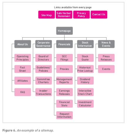
To create the visuals for your sitemap, you can follow this process.
1. Start by defining your home page – this should be the top item in the hierarchy.
2. Place the main navigation items below this.
3. Start arranging your pages of content below the main navigational items, according to the results of your user testing and insight, and your information architecture structure.
4. Continue adding pages below this until you have placed all your content. Make sure that every page is accessible from at least one other page – it may seem obvious, but you’d be surprised how often this is overlooked!
5. Define any other static navigation elements (footer, sidebar, header navigation, search tools). Place these in your diagram in a logical place (possibly branching off directly from the home page, or as separate blocks).
Which sitemap is which?
The term ‘sitemap’ can have two meanings. One is the way it’s defined above – the structural plan of the website. The other is a page on your website that lists all the pages available in a logical and accessible way. An example is the Apple website’s sitemap: www.apple.com/sitemap. This sitemap should be available from every page. Dynamic sitemaps can be employed so that the sitemap is
updated automatically as information is added to the website. Different sitemaps exist for different purposes, so investigate what your users would find most useful.
Universal mobile UX principles
there are three main approaches to creating mobile-accessible content:
1. Mobile websites (called mobi sites)
2. Native and web applications (called apps)
3. Responsive websites (websites that adapt to the device).
Whether you’re designing a mobi website, an app or a nifty responsive site, there are some principles you should always keep in mind:
• Simplify.Show information only when it’s needed. While you should ensure that the mobile asset provides all the same information as the desktop equivalent, this doesn’t need to be presented in the same format or volume.
• Reduce loading time. Try to keep content and actions on the same page, as this ensures better performance as there are fewer page loads.
• Encourage exploration.Especially on touchscreens, users like to browse elements and explore. This makes them feel in control.
• Give feedback. Ensure that it is clear when the user performs an action. This can be achieved through animations and other visual cues.
• Communicate consistently. Ensure that you deliver the same message across all your touchpoints, for example, by using the same icons on the website as you would on the mobile app – this prevents users from having to relearn how you communicate.
• Predict what your user wants. Include functionality such as auto-complete or predictive text. Remove as much manual input as possible to streamline users’ experience.
Limitations of mobile
While there are many benefits to mobile, there are also challenges that the UX practitioner needs to overcome.
• Small screens. Even the largest smartphones are screens many times smaller than a standard laptop (and tablets fall somewhere between the two). This, quite simply, means that the user has a much smaller window through which to perceive and understand the website, so it’s difficult to get an overall impression of where things are or what’s important.
• Difficult inputs.Mobile phones don’t come with full-sized keyboards and mouses, so they are usually a lot more difficult to operate fluidly and accurately than desktop computers (touchscreens may be the exception here, although they also have their own pitfalls).
• Slow connection speeds.Many mobile phone users, especially in developing countries, are on slow Internet connections – and even fast options such as 3G can often be more sluggish than a desktop
equivalent. This makes loading large websites or images slow and frustrating – and also expensive in terms of data costs.
• Slow hardware. Sometimes the slowness comes from the hardware itself – the more basic the phone, the slower its processing components are likely to be, making the simple act of opening the browser and loading a page time consuming.
Mobile users
Mobile users can be different from desktop users. There is an ongoing debate about whether the mobile users’ context (for example, lounging on the couch versus rushing to a meeting) affects the way in which they use their devices. There’s no definitive way of defining mobile context – it all comes down to the user, brand and web asset – but it’s important to remember that you need to take the user’s context into account, whatever it may be. Mobile users are:
• Goal orientated. They turn to mobile devices to answer a question, quickly check email, find information or get directions. They often have a distinct purpose in mind when using their phone.
• Time conscious. There are two aspects to this. On the one hand, mobile users are often looking for urgent or time-sensitive information (such as the address of the restaurant they are looking for), so answers should be available as quickly as possible. On the other hand, the mobile device is also frequently used to kill time or as a source of entertainment (reading articles on the couch, or playing games while waiting in a queue), so content is also crucial. User research will tell you which of these groups your users fall and how you need to structure your site accordingly.
• Search dominant. Even users who know what they are looking for tend to navigate there via search (for example, typing the brand name into Google) rather than accessing the page from a bookmark or typing the URL directly into the browser bar.
• Locally focused. 50% of all mobile searches in 2012 were for local information (Sterling, 2012). Since mobile phones are always carried, users turn to them to find information on things in their surroundings – from local businesses to more detail on a product they have just seen.

Mobile devices
One of the biggest challenges to mobile UX, and indeed any venture involving mobile, is the sheer number of different device categories and models available – one estimate puts the number of mobile phone handset models at over 6300, running over 20 distinct operating systems (CEM4Mobile, 2011).
Broadly speaking, there are five main categories that mobile devices can fall into.
• Dumb or basic phones offer no Internet access, just basic call and SMS functionality.
• Feature phones are rudimentary mobile phones that can perform basic communication functions, and possibly connect to the web, but have limited functionality.
• Smartphones are powerful mini-computers that have full web access, larger screens, and a wide range of functionality.
• Tablets are larger versions of smartphones, usually including touchscreens, and are able to perform a wide range of connectivity, lifestyle and work functions.
• Other mobile devices – such as ebook readers, netbooks, portable game consoles and other media devices such as iPods – can have a range of features and varying ability to connect to the web.
Mobile UX
Mobile should not be an afterthought, in UX or any other digital endeavour – it should be prioritised in strategy, design and implementation. The ‘mobile first’ movement supports this notion, and aims to create mobile user experiences first, and then adapt these for the web (instead of the other way around). Designing this way has many advantages, since the principles of good mobile UX works just as well on full sites – simple designs, linear interfaces and clear buttons and features. Mobile first also focuses you on deciding which content is most essential.
Credibility
Credibility means how trustworthy and legitimate something looks, and is a big consideration for web users when deciding to use your website or not. Here are some of the cues that visitors use to determine the credibility of a website:
• Looks– does it look professional and beautiful?
• Prominent phone numbers and addresses where they are easy to locate– this assures the visitor that there are real people behind the website, and that they are in easy reach.
• Informative and personal ‘about us’– your customers want to see the inner workings of a company and are especially interested in learning more about the head honchos. Consider including employee pictures and profiles to add personality to the site.
• Genuine testimonials– this is a great way to show potential customers what your current customers have to say about your organisation. Trust is vital, and this is one way to encourage it.

• Logos of associations and awards– if you belong to any relevant industry associations or have won any awards, feature them. Not only does this go a long way towards establishing your credibility, but it will show that you’re at the top of your game, a notch above the competition.
• Links to credible third-party references or endorsements– this is a way to assert your credibility without tooting your own horn.
• Fresh, up-to-date content – a news section that was last updated a year ago implies that nothing has happened since (or that no one cares enough to update it).
• No errors– spelling and grammar mistakes are exceptionally unprofessional, and while the large majority of readers may not pick them up, the one or two who do will question your credibility. This also extends to broken links, malfunctioning tools, and interactive elements that don’t work as advertised.
Simplicity
In UX projects, the simpler option is almost always the better, more user-friendly one. Though your service or product may be complex, that doesn’t mean your customer-facing web portals need to be. In fact, it’s important to remember that most customers want only the most basic information from you, such as “What is this?” and “How does it work?”
Simplicity can mean several things:
• Lots of empty space. In design terms, this is referred to as negative or white space (though, of course, it need not specifically be white). Dark text on a light background is easiest to read. In general, the more effectively ‘breathing room’ is placed between various page elements, lines of text, and zones of the page, the easier it is for the user to grasp where everything is.
• Fewer options. When users have to make choices, there is a lot of psychology at play – worry about making the right choice, confusion and doubt over the options, indecision paralysis and more. Studies have found that people faced with fewer choices generally choose more quickly and confidently, and are more satisfied with their decision afterwards (Roller, 2010).
• Plain language. Unless your website is aimed at a highly specialised technical field, there’s usually no need to get fancy with the words you use. Clear, simple, well-structured language is the best ption when creating a great UX.
• Sticking to conventions. As we’ve said before, conventions are excellent shortcuts for keeping things simple for users. There’s no need to reinvent the wheel and try to teach your users a whole new way of navigating a website.

Usability and conventions
Usability is about making the digital assets we build easy and intuitive to use. To paraphrase Steve Krug, don’t make your users think: they should just do (Krug, 1997-2013).
One of the most important aspects of usability involves sticking to standard conventions, which are simply common rules or ways of displaying or structuring things on the web. Popular conventions include:
• Links that are blue and underlined
• Navigation menus at the top or left of the web page
• The logo in the top left hand corner, which is linked to take the user back to the home page
• Search boxes placed at the top of the page, using standard wording such as ‘search’, or a magnifying glass icon.
Ensure that all website elements (such as menus, logos, colours and layout) are distinct, easy to find and kept consistent throughout the site.
There are some key ‘don’ts’ when it comes to building a user-friendly and usable website:
• Never resize windows or launch the site in a pop-up.
• Don’t use entry or splash pages (a page that site visitors encounter first before reaching the home page).
• Never build a site entirely in Flash – most search engine spiders cannot effectively trawl Flash sites, and these will not work on many mobile devices.
• Don’t distract users with ‘Christmas trees’ (blinking images, flashing lights, automatic sound, scrolling text, unusual fonts, etc.).
It’s useful to consider usability guidelines to ensure that your website is on track. MIT Information Services & Technology provides a usability checklist online at http://ist.mit.edu/usability.
User-centric design
While this may seem like the most obvious point, it’s surprising how often the user is forgotten in the userexperience. Business owners, marketers and web developers frequently focus on creating the web platforms they want and think are best, instead of really interrogating what the user needs. Often, the performance of web assets is compromised when the design process is driven only by internal business needs (for instance, ensuring that each department in the company has a space that it controls on the home page) at the expense of what the user needs. When designing for the user, you need to ask the following questions:
• Who is the user?
• What are the user’s wants and needs from your platform?
• Why is the user really coming to your website?
• What are the user’s capabilities, web skills and available technology?
• What features would make the user’s experience easier and better?
The answers to these questions will come out of user research, as discussed in the Market Research chapter earlier in this book.

Of course, many users may not know exactly what their wants and needs are! It is the UX practitioner’s job to discover these through research and interpret them in the best way possible. Keep Henry Ford’s famous quote in mind here: “If I had asked people what they wanted, they would have said faster horses.”
The benefits of UX
There are some real, tangible benefits to applying UX design to digital marketing strategies.
Good UX is an excellent way to differentiate yourself in the market and give yourself a competitive advantage. If your online touchpoints are easy, fun, intuitive and awesome to use, your customers won’t have any reason to look elsewhere.
Good UX research and design allows you to find the best solution for your needs. Every business, website and online service is unique in some way, which means that the way it is set up must be unique too.
Amazon’s $300 million buttonis perhaps the most dramatic example of how a simple UX fix can impact the business. Amazon managed to gain an extra $300 million worth of sales simply by changing their ‘Register’ button to one that read ‘Continue’ instead. The number of customers increased by 45% because they no longer felt they needed to go through an onerous registration process simply to fulfil a basic shopping action. In fact, nothing else about the purchase process had been changed!
Every marketer knows that the ideal customer is a happy customer. People who love the experience you give them will become loyal clients, and possibly even brand evangelists – people who will sing your praises far and wide.
Applying UX principles means that you can get your digital tools working earlier, with much better functionality, at a lower cost. This is because you can cut out features and elements that you simply don’t need, and focus on the core user experience. This optimised development process leads, in turn, to sites that are easier and cheaper to maintain, upgrade and support across multiple platforms.
Understanding UX design
User experience (UX) can be defined as all the experiences (physical, sensory, emotional and mental) that a person has when interacting with a digital tool.
The field of UX is full of similar-sounding jargon, so here’s a quick guide to the terms you should know.
User experience (UX)is the overall satisfaction a user gets from interacting with a product or digital tool.
User experience design (UXD, sometimes UED) is the process of applying proven principles, techniques and features to a digital tool to create and optimism the user experience.
User-centred design (UCD)is the design philosophy that priorities the user’s needs and wants above all else, and places the user at the center of the entire experience. This often entails research and testing with real users of the site or product.
User interface (UI)is the user-facing part of the tool or platform – the part of the actual website, application or tool that the user interacts with. Usability means how user friendly, efficient and slick the digital product is.
Online UX can be divided into two broad categories:
1. Functional UX. This covers the elements of the user experience that relate to actually using the tool – such as working technical elements, navigation, search and links.
2. Creative UX. This is the bigger, harder-to-define impression created by the tool – the so-called ‘wow’ factor that covers visual and creative elements.
There are six qualities that make up good UX:
• Findability – can I find it easily? Does it appear high up in the search results?
• Accessibility – can I use it when I need it? Does it work on my mobile phone, or on a slow Internet connection? Can I use it as a disabled person?
• Desirability– do I want to use it? Is it a pleasant experience, or do I dread logging in?
• Usability – is it easy to use? Are the tools I need intuitive and easy to find?
• Credibility– do I trust it? Is this website legitimate?
• Usefulness– does it add value to me? Will I get something out of the time I spend interacting with it?
Key terms and concepts User Experience Design
| Term | Definition |
|---|---|
| Above the fold | The content that appears on a screen without a user having to scroll. |
| Accessibility | The degree to which a website is available to users with physical challenges or technical limitations. |
| Breadcrumbs | Links, usually on the top of the page, that indicate where a page is in the hierarchy of the website. |
| Call to action (CTA) | A phrase written to motivate the reader to take action (sign up for our newsletter, book car hire today etc.). |
| Content audit | An examination and evaluation of existing content on a website. |
| Content strategy | In this context, a plan that outlines what content is needed for a web project and when and how it will be created. |
| Convention | A common rule or tried-and-tested way in which something is done. |
| Conversion | Completing an action or actions that the website wants the user to take. Usually a conversion results in revenue for the brand in some way. Conversions include signing up to a newsletter or purchasing a product. |
| Credibility | In this context, how trustworthy, safe and legitimate a website looks. |
| Information architecture | The way data and content are organised, structured and labelled to support usability. |
| Navigation | How a web user interacts with the user interface to navigate through a website, and the elements that assist in maximising usability. |
| Prototype | Interactive wireframes that have been linked together like a website, so that they can be navigated through by clicking and scrolling. |
| Responsive design | Designing a website so that it changes depending on the device it is displayed on. |
| Search engine optimisation (SEO) | The process of improving website rankings on search engine results pages. |
| Sitemap | On a website, a page that links to every other page in the website, and displays these links organised according to the information hierarchy. In UX terminology, this is the visualised structural plan for how the website’s pages will be laid out and organised. |
| Usability | A measure of how easy a system is to use. Sites with excellent usability fare far better than those that are difficult to use. |
| User-centred design (UCD) | The design philosophy where designers identify how a product is likely to be used, taking user behaviour into consideration and prioritising user wants and needs, and placing the user at the centre of the entire experience. |
| User experience design (UXD) | The process of applying proven principles, techniques and features to create and optimise how a system behaves, mapping out all the touchpoints a user experiences to create consistency in the interaction with the brand. |
| User interface (UI) | The user-facing part of the tool or platform – the actual website, application, hardware or tool with which the user interacts. |
| Wireframe | The skeletal outline of the layout of a web page. This can be rough and general, or very detailed. |
User Experience Design Introduction
Have you ever visited a website that was just plain confusing, with broken links, unintuitive navigation and long, rambling text? Or, conversely, have you had a web experience that just worked, where everything was clear, easy and even enjoyable to use? If so, you’ve encountered the extremes of user experience design. Excellent UX can delight and convert customers. Conversely, bad UX can lead to lost revenue and less chance of repeat visitors.
User experience design is a web concept that is difficult to define specifically, since it’s often a case of ‘you’ll know it when you see it’. A standard website needs to be reliable, functional and convenient – but a great UX website needs to be enjoyable to use, and an experience worth sharing. What this means in practice for a specific website, company, audience or context can differ, but the principle remains the same – delivering a great experience to users, and making it easy for them to convert to your desired goal. UX is the first, foundational step of an effective digital asset.
• To think about web projects with a UX mindset
• How to create usable, amazing and enjoyable experiences for desktop and mobile users
• The nuts and bolts of implementing UX strategy step by step
• About a variety of awesome UX tools.
Introduction to Create
Research, planning and strategy lay the foundation for building successful digital assets – such as websites, mobile sites, web and social media applications, videos and even simple landing pages. In the next few chapters, we detail how to create some of these digital assets.
One of the biggest challenges is creating assets that make the most of rapidly evolving technology, while remaining accessible to the range of users in your market. In writing these chapters, we faced a similar challenge: technology is constantly in flux. Because of this, we have focused on principles for success.
Creating digital assets is not a solitary job. There are many different teams of experts who work together to create something that will delight users. So, it stands to reason that there are many aspects to consider when looking at creating digital assets.
This is a book aimed at marketers, rather than developers and designers, but it is important that you also understand the opportunities and challenges of the web. This is a vast subject, but hopefully the next few chapters will leave you feeling equipped to ask the right questions when relying on others to get the job done for you.
We start by looking at User Experience Design – the process of creating remarkable, user-friendly and effective digital assets. The Web Development and Design chapter focuses on creating websites, but the principles apply to a range of digital assets and devices (with a dedicated section on mobile). While we won’t teach you how to build a website yourself, we do equip you with what you need to know to manage and be involved in the process. Lastly, we look at Writing for Digital – after all, the words we read on the screen are often a vehicle for much of our online experience. All three of these practices work closely together when we create web assets.
Summary Content marketing
Content marketing presents a pull mechanism for the marketer rather than a push one. Brands must consider their brand identity and the market they are trying to reach in order to create targeted and valuable brand content that delivers on strategic objectives.
It’s about more than creating a piece of content – content marketing strategy looks at how you structure your organisation to create that content, and how you match specific types of content and
methods of delivery for achieving strategic outcomes.
These ideas need to resonate with people rather than simply existing across an array of media with which they are presented.
Advantages and challenges
Content marketing can position your brand as an expert through the sharing of useful content in your specific field. It also enables you to reach the customer who has a fragmented attention span spread across many devices and content touchpoints.
One of the more powerful benefits, however, is that you can learn a lot about your target consumer through the content with which they do or do not engage. The more targeted and ongoing your content, the more data you can gather about how effectively you are reaching those you need to.
One of the great challenges in content marketing is providing content that is truly interesting and engaging to the right people – the right mix of subject matter and brand. Matching content to the required outcome for your strategic purposes takes dedication and focus. In the context of ongoing content production, it can also be a challenge to maintain levels of quality over time, which is why process and quality assurance steps must be put in place. Consider that the goal is not to create as
much content as possible, rather it is to focus on relevance and content that matches strategic outcomes.
Tools of the trade
In order to support the ongoing production of interesting content, it is necessary to have some planning documents in place. Consider those outlined below.
Brand style guides
This document guides anyone creating content for a brand at any time. What is the tone of voice and brand personality? How is it best represented visually, and what are the brand colors and fonts? This can be a challenging document to put together, and it usually isn’t the content marketer who is tasked with doing so, but is essential to aligning brand communications. It is also a document that tends to be ‘live’ – it is constantly updated as the brand and content landscapes evolve and new conventions need to come into play.
Content calendars
Content calendars assist the content marketer in planning the content they will be sharing, across which platforms, and when. The more advance planning is undertaken, the easier it is to react quickly to tactical opportunities.
Workflow map
A workflow map documents the path a piece of content takes when it is created. What are the steps in approval, how is it optimised for digital publishing, who has final sign off? Is it a duplicate of existing content, and where else can it be used? A workflow map assists you in streamlining this process.

Persona map
As discussed, the persona map assists content creators in focusing on those for whom they are in fact creating content, and what the motivations of consumers would be.
Understanding your channels
Understanding the channels through which you share content is as important as the crafting of that content itself. Reaching people effectively will only be achieved if the medium supports the message and vice versa. Social media, email marketing, mobile marketing and video marketing are just some disciplines that will form part of your content creation arsenal. The rest of this book is dedicated to best practice in communicating effectively through the various digital disciplines available to you.
Algorithmic curation
Algorithmic curation is a term that refers to the algorithms platforms have created for dealing with information overload. Various platforms, like Facebook and the search engine Google, use algorithms to filter out the amount of information that is delivered to users. Each algorithm will use a number of factors to determine what is actually relevant and interesting to the person doing a search, or looking at their news feed. One of the factors that influences whether a piece of content is considered relevant is how much an individual engages with the brand’s presence on that platform over time. Posts shared by a Facebook page, for example, may reach only users who have previously engaged with posts from that page through commenting or liking. It is therefore important to create content that encourages engagement and sharing.
Content models
Your organisation’s content requirements and objectives should determine the structure of your content teams. Do you have a need for ongoing content creation, or are there less frequent high-input forms of content that will benefit your organisation? There are many models which are constantly evolving, so do invest in some research around what will suit your organisation. We have outlined two approaches below.
Stock and flow
Stock content refers to bigger, beautiful assets that require more investment and age well, meaning that they will be interesting in six months as well as today. ‘The Dewarists’, by Dewars, is an example of this. A high-production value TV show was created and sponsored by the brand in order to achieve awareness across its target market.

Flow content has a lower production value and a quicker production and publishing time frame. Images depicting what is going on at a business on any given day, for example, freshly baked goods at a bakery, can be placed in this category.

Both types of content should be considered for balancing out a content strategy.
Destination and distributed thinking
It can also be useful to consider destination and distributed content. Content which you are either sending out to the world through various platforms and networks, or which pulls your reader towards a page on your website or an article on your blog. Rather than focusing solely on driving readers to your owned media spaces, such as your website, consider how to create content that engages with your target audience in the spaces where they are active.
Always on content planning
Given that a large part of the global population is constantly engaging with content via various digital devices and platforms, it is necessary to consider content creation in terms of not only short campaign bursts, but ongoing delivery and engagement. Consider the illustration below.

By constantly engaging with audiences, something which is well suited to social media, for example, it is possible to build and maintain a relationship with customers/readers. Consider the image above, where constant engagement builds on the peaks of engagement that shorter term campaigns can offer.
Resource planning – thinking like a publisher
Content marketing touches on a number of departments in an organisation. Marketing, sales, customer service, corporate communications, human resources and website management teams should all be aware of the content marketing strategy for a business. Co-ordinating content between these teams can be challenging if not impossible if turnaround times are tight. This is why it is important not only to look at where content production should live in your organisation, but also to map the workflow of content creation, an essential function. Are designers involved? Where does quality control take place? Where can a piece of content be adapted and reused on a different distribution channel?
Some organisations opt to have a central role for someone who oversees content; others build in-house departments. Whether you are outsourcing to a publishing house, or training a team in house, the decision must be made and planned for so that workflow can be mapped in order to facilitate your strategic needs.
Learning from publishers
The term brand as publisherrefers to repositioning the function of the marketer or brand manager. Rather than focusing on the immediate sale or conversion, a publisher focuses on value and interest for the reader, and building a relationship based on supplying information or entertainment that suits the customer’s needs.
Makeup.com by L’Oreal is an oft-cited example of a brand publishing useful tips and content that does not link to a product or sales directly, but demonstrates how the brand can give consumers the lifestyle they desire.
The content audit
Once you have established your marketing goals, your brand personality and a guiding understanding of who you are trying to reach, the content audit is a sometimes laborious but necessary next step. The content audit involves an audit of all the existing content supplied by the brand – the website, white papers, articles, videos and content shared on social media sites can all be considered.
An assessment can then be made of how well these pieces of content match the strategic needs of the brand and its audience.
While you can either thoroughly immerse yourself in this process or attempt to get a more time-efficient overview, the goal is to map what is currently on offer with what is necessary in mind. It is important not just to understand what you have, but also how it is currently organised and accessed by your audience.
Many practitioners suggest the use of a spreadsheet to achieve this. Content can be found to be either mismatched to the goals of the organisation, or spot on. Most importantly, you can establish what is missing. Are your customer needs being addressed? Where do the opportunities lie?
Matching content formats to objectives
Information can be presented through any number of mediums, which is both an opportunity and a challenge faced by content marketers. Digital distribution allows for videos, images, interactive infographics and any number of other formats. To gain and keep the attention of consumers/users, it’s sometimes not enough to rely simply on text-based forms of content. The role of the content marketer is to select the right medium based on overall objectives, production capabilities, and the needs of the audience. Consider the illustration below.

paper or useful case study could be more effective in convincing them that you are the best choice in the market.
There are many examples of online journalism using multimedia to convey information most effectively to their readers. The New York Timeshas presented a number of different methods for conveying complex information in an engaging manner. ‘Snow Fall’ by John Branch is one example (http://www.nytimes.com/projects/2012/snow-fall/#/?part=tunnel-creek).

The New York Timesalso often publishes infographics that demonstrate this principle powerfully.

In order to take advantage of these various forms of content delivery, it is necessary to build the correct capabilities. But how do you determine what forms of content you need?
Creating content pillars
Linked to the brand identity are certain themes, which could also be called content pillars. These are areas of focus that support the creation of content that match to a consumer’s interest. These themes must be true to the brand essence, not focused directly on sales, and should also speak to the interests of the audience.

For Coca-Cola, for example, consumer interests filtered through the brand essence of ‘Coke brings joy’ could result in the following pillars:
• Friendship
• Sharing is caring
• Spreading smiles.
These pillars are then used as the basis on which to develop content ideas.

In the above tweet, we can see how a particular content pillar was translated into a question that is focused on relationships and family. It also encourages engagement from the audience by asking for their input.
Another example which demonstrates this is how Corona brought their brand essence to life through an interactive documentary. The documentary depicted the first encounter that people from Bulin in China, 7 500 km from the coast, had with the beach. You can view it here:
http://www.coronaextra.eu.

Subscribe to:
Posts (Atom)